3. matplotlib
matplotlib 是 python 中一个非常强大的 2D 函数绘图模块,它提供了子模块 pyplot 和 pylab 。pylab 是对 pyplot 和 numpy 模块的封装,更适合在 IPython 交互式环境中使用。
经典参考:绘图: matplotlib核心剖析
对于一个项目来说,官方建议分别导入使用,这样代码更清晰,即:
0 1 | import numpy as np
import matplotlib.pyplot as plt
|
而不是
0 | import pylab as pl
|
3.1. 基本绘图流程
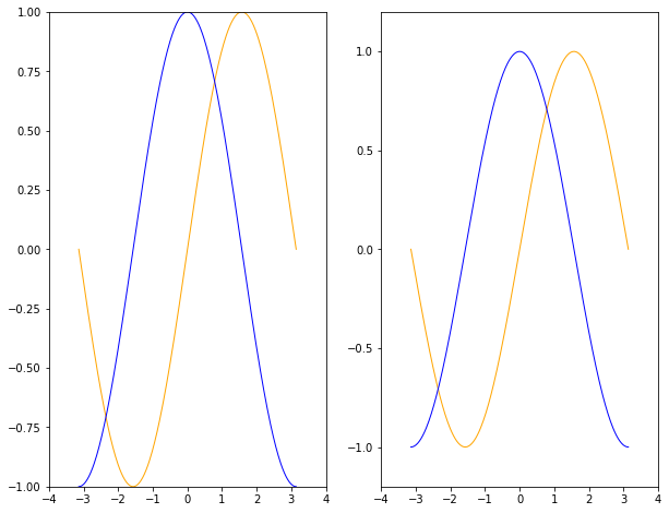
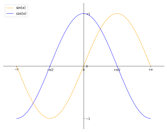
这里以绘制正余弦函数图像为例。
0 1 2 3 4 5 6 7 8 9 10 11 12 13 14 15 | # 分别导入 numpy 和 pyplot 模块
import numpy as np
import matplotlib.pyplot as plt
# 生成 X 坐标,256个采样值足够图像平滑
X = np.linspace(-np.pi, np.pi, 256, endpoint=True)
# 生成 Y 坐标
C,S = np.cos(X), np.sin(X)
# 绘制正余弦
plt.plot(X,S)
plt.plot(X,C)
# 显示图像
plt.show()
|
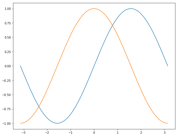
matplotlib 默认绘制的正余弦函数图像
3.1.1. 默认配置
matplotlib 的相关配置主要包括以下几种,用户可以自定义它们:
- 图片大小和分辨率(dpi)
- 线宽、颜色、风格
- 坐标轴、坐标轴以及网格的属性
- 文字与字体属性。
所有的默认属性均保存在 matplotlib.rcParams 字典中。
3.1.1.1. 默认配置概览
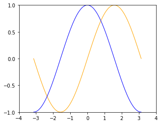
0 1 2 3 4 5 6 7 8 9 10 11 12 13 14 15 16 17 18 19 20 21 22 23 24 25 26 27 28 | X = np.linspace(-np.pi, np.pi, 256, endpoint=True)
C,S = np.cos(X), np.sin(X)
# 创建一个宽10,高8 英寸(inches,1inch = 2.54cm)的图,并设置分辨率为72 (每英寸像素点数)
plt.figure(figsize=(10, 8), dpi=72)
# 创建一个新的 1 * 1 的子图,接下来的图样绘制在其中的第 1 块(也是唯一的一块)
plt.subplot(1,1,1)
# 绘制正弦曲线,使用绿色的、连续的、宽度为 1 (像素)的线条
plt.plot(X, S, color="orange", linewidth=1.0, linestyle="-")
# 绘制余弦曲线,使用蓝色的、连续的、宽度为 1 (像素)的线条
plt.plot(X, C, color="blue", linewidth=1.0, linestyle="-")
# 设置 x轴的上下限
plt.xlim(-np.pi, np.pi)
# 设置 x轴记号
plt.xticks(np.linspace(-4, 4, 9, endpoint=True))
# 设置 y轴的上下限
plt.ylim(-1.0, 1.0)
# 设置 y轴记号
plt.yticks(np.linspace(-1, 1, 5, endpoint=True))
# 在屏幕上显示
plt.show()
|
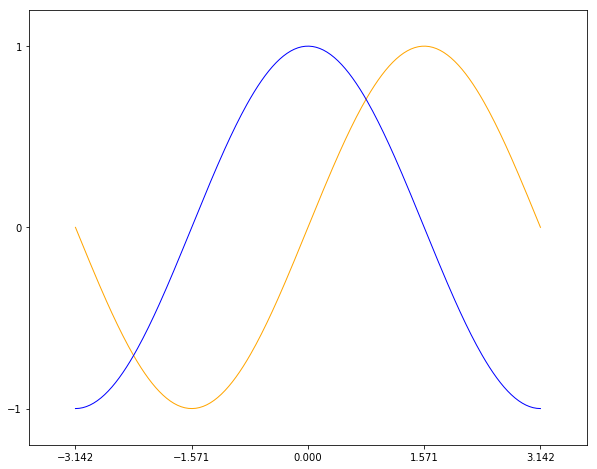
我们可以依次改变上面的值,观察不同属性对图像的影响。
3.1.1.2. 图像大小等
图像就是以「Figure #」为标题的那些窗口。图像编号从 1 开始,与 MATLAB 的风格一致,而于 Python 从 0 开始的索引编号不同。以下参数是图像的属性:
参数 默认值 描述 num 1 图像的数量 figsize figure.figsize 图像的长和宽(英寸) dpi figure.dpi 分辨率(像素/英寸) facecolor figure.facecolor 绘图区域的背景颜色 edgecolor figure.edgecolor 绘图区域边缘的颜色 frameon True 是否绘制图像边缘
0 1 2 3 4 5 6 7 8 9 10 11 | import matplotlib as mpl
figparams = ['figsize', 'dpi', 'facecolor', 'edgecolor']
for para in figparams:
name = 'figure.' + para
print(name + '\t:', mpl.rcParams[name])
>>>
figure.figsize : [10.0, 8.0]
figure.dpi : 72.0
figure.facecolor : white
figure.edgecolor : white
|
我们可以通过查询参数字典来获取默认值。除了图像 num 这个参数,其余的参数都很少修改,num 可以是一个字符串,此时它会显示在图像窗口上。
plt.figure(figsize=(5, 4), dpi=72)
plt.figure(figsize=(10, 8), dpi=36)
可以看到调整长宽英寸数和分辨率均会影响图片显示大小,以宽度为例,显示大小为 w * dpi / 显示屏幕宽度分辨率。
14 英寸显示屏是指屏幕对角线长度 35.56cm,如果屏幕宽高比为 16 : 9,则宽和高约为 31cm 和 17.4cm,如果分比率为 1920 * 1080,则上述图像显示宽度的 10 * 36 / 1920 * 31 = 5.8cm,或者 5 * 72 / 1920 * 31 = 5.8cm。
高 dpi 显示图像更细腻,但是图像尺寸也会变大。使用默认值即可。如果图像非常复杂,为了看清细节,我们可以调整宽高的英寸数。
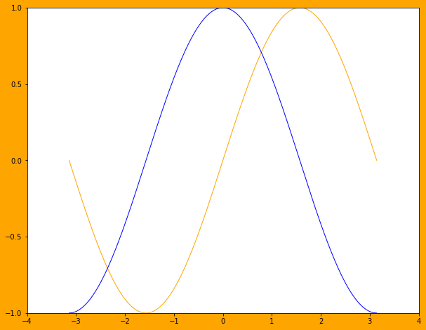
plt.figure(figsize=(10, 8), dpi=72, facecolor=’orange’)
绘图区域的背景色改为橙色的效果,通常不需要改变它。
3.1.1.3. 线条的颜色
0 | plt.plot(X, S, color="orange", linewidth=1.0, linestyle="-")
|
上文中,已经观察到线条属性有如下几个:
颜色,color/c 参数指定。我们可以通过 help(plt.plot) 查看帮助信息,颜色属性可以通过如下方式指定:
- 颜色名,例如 ‘green’。
- 16进制的RGB值 ‘#008000’,或者元组类型 RGBA (0,1,0,1)。
- 灰度值,例如 ‘0.8’。
- 颜色缩写字符,例如 ‘r’ 表示 ‘red’
当前支持的颜色缩写有:
缩写字符 颜色 ‘b’ blue ‘g’ green ‘r’ red ‘c’ cyan ‘m’ magenta ‘y’ yellow ‘k’ black ‘w’ white
0 1 2 3 4 5 6 7 | plt.subplot(2,2,1)
plt.plot(X, S, color='orange', linewidth=1.0, linestyle="-")
plt.subplot(2,2,2)
plt.plot(X, S, color='b', linewidth=1.0, linestyle="-")
plt.subplot(2,2,3)
plt.plot(X, S, color='0.8', linewidth=1.0, linestyle="-")
plt.subplot(2,2,4)
plt.plot(X, S, color='#003333', linewidth=1.0, linestyle="-")
|
分别指定四种颜色参数画图
3.1.1.4. 线条的粗细
线宽,linewidth/lw,浮点值,指定绘制线条宽度点数。
0 1 2 3 4 5 6 7 | plt.subplot(2,2,1)
plt.plot(X, S, color='blue', linewidth=0.5, linestyle="-")
plt.subplot(2,2,2)
plt.plot(X, S, color='blue', linewidth=1.0, linestyle="-")
plt.subplot(2,2,3)
plt.plot(X, S, color='blue', linewidth=1.5, linestyle="-")
plt.subplot(2,2,4)
plt.plot(X, S, color='blue', linewidth=2.0, linestyle="-")
|
四种线宽画图
3.1.1.5. 线条的样式
线条样式, linestyle/ls 指定绘制线条的样式,当前支持的线条样式表如下:
样式缩写 描述 ‘-‘ 实线 ‘–’ 短划线 ‘-.’ 点划线 ‘:’ 虚线
0 1 2 3 | linestyles = ['-', '--', '-.', ':']
for i in range(1, 5, 1):
plt.subplot(2,2,i)
plt.plot(X, S, color='blue', linewidth=1.0, linestyle=linestyles[i-1])
|
四种线条样式画图
3.1.1.6. 线条的标记
标记,marker,可以使用标记代替 linestyle 画图。常用标记如下:
标记缩写 描述 ‘.’ point marker ‘,’ pixel marker ‘o’ circle marker ‘v’ triangle_down marker ‘^’ triangle_up marker ‘<’ triangle_left marker ‘>’ triangle_right marker ‘1’ tri_down marker ‘2’ tri_up marker ‘3’ tri_left marker ‘4’ tri_right marker ‘s’ square marker ‘p’ pentagon marker ‘*’ star marker ‘h’ hexagon1 marker ‘H’ hexagon2 marker ‘+’ plus marker ‘x’ x marker ‘D’ diamond marker ‘d’ thin_diamond marker ‘|’ vline marker ‘_’ hline marker
0 1 2 3 4 5 6 | # 降低X坐标数量,以观察标记的作用
X = np.linspace(-np.pi, np.pi, 56, endpoint=True)
......
markers = ['.', ',', 'o', 'v']
for i in range(1, 5, 1):
plt.subplot(2,2,i)
plt.plot(X, S, color='blue', linewidth=0.0, marker=markers[i-1])
|
四种标记画图
3.1.1.7. 图片边界
上述图像在 Y 轴上会和边界重合,我们可以调整轴的上下限来调整曲线在图像中的位置。
0 1 2 3 4 | # 设置 x轴的上下限
plt.xlim(-np.pi, np.pi)
# 设置 y轴的上下限
plt.ylim(-1.0, 1.0)
|
0 1 | # 扩展 y轴的上下限 10%
plt.ylim(-1.1, 1.1)
|
扩展Y轴上下10%对比图
一个可重用的设置边界的扩展函数如下:
0 1 2 3 4 5 6 7 8 9 10 11 12 13 14 15 | def scope_adjust(X, axis='X', scale=0.1):
xmin, xmax = X.min(), X.max()
dx = (xmax - xmin) * scale
if axis == 'X':
plt.xlim(xmin - dx, xmax + dx)
else:
plt.ylim(xmin - dx, xmax + dx)
# 扩展 x 轴边界 10%
def xscope_adjust(X):
scope_adjust(X, 'X')
# 扩展 y 轴边界 10%
def yscope_adjust(Y):
scope_adjust(Y, 'Y')
|
3.1.1.8. 坐标记号标签
当讨论正弦和余弦函数的时候,通常希望知道函数在 ±π 和 ±π/2 的值。这样看来,当前的设置就不那么理想了。默认坐标记号总是位于整的分界点处,例如 1,2,3或者0.1,0.2处。
我们要在 x = π 处做记号,就要使用 xticks() 和 yticks() 函数:
0 1 2 3 4 | # 设置 x轴记号
plt.xticks([-np.pi, -np.pi/2, 0, np.pi/2, np.pi])
# 设置 y轴记号
plt.yticks([-1, 0, +1])
|
设置 x轴和 y轴记号
记号现在没问题了,不过标签却不大符合期望。我们可以把 3.142 当做是 π,但毕竟不够精确。当我们设置记号的时候,我们可以同时设置记号的标签。注意这里使用了 LaTeX 数学公式语法。
0 1 2 3 4 5 | # 设置 x轴记号和标签
plt.xticks([-np.pi, -np.pi/2, 0, np.pi/2, np.pi],
[r'$-\pi$', r'$-\pi/2$', r'$0$', r'$+\pi/2$', r'$+\pi$'])
# 设置 y轴记号和标签
plt.yticks([-1, 0, +1], [r'$-1$', r'$0$', r'$+1$'])
|
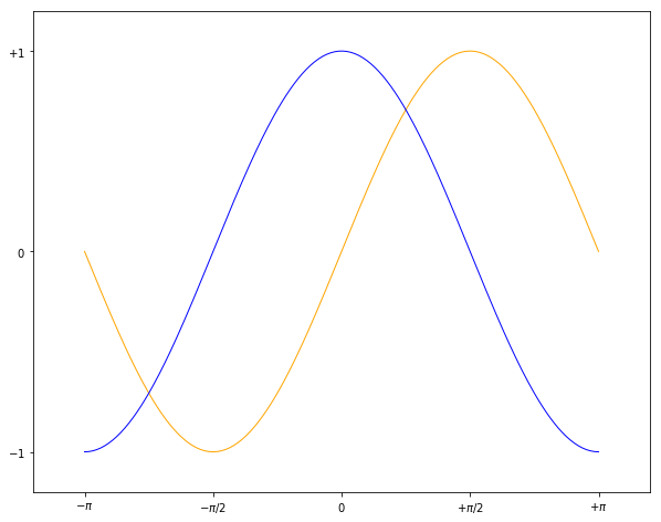
设置 x轴和 y轴记号和标签
3.1.1.9. 移动脊柱(坐标轴)
坐标轴线和上面的记号连在一起就形成了脊柱(Spines,一条线段上有一系列的凸起,很像脊柱骨),它记录了数据区域的范围。它们可以放在任意位置,不过至今为止,我们都把它放在图的四边。
实际上每幅图有四条脊柱(上下对应 x坐标轴,左右对应 y坐标轴),为了将脊柱放在图的中间,我们必须将其中的两条(上和左)设置为无色,然后调整剩下的两条到合适的位置,这里为坐标轴原点。
0 1 2 3 4 5 6 | ax = plt.gca()
ax.spines['left'].set_color('none')
ax.spines['top'].set_color('none')
ax.xaxis.set_ticks_position('bottom')
ax.spines['bottom'].set_position(('data', 0))
ax.yaxis.set_ticks_position('right')
ax.spines['right'].set_position(('data', 0))
|
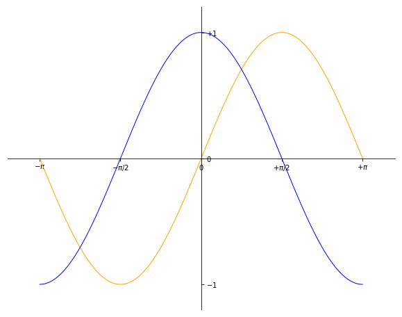
移动脊柱后的效果图
3.1.1.10. 添加图例
我们在图的左上角添加一个图例。为此,我们只需要在 plot 函数里以键值的形式增加一个参数。
0 1 2 | plt.plot(X, S, color='orange', linewidth=1.0, linestyle='-', label='sin(x)')
plt.plot(X, C, color='blue', linewidth=1.0, linestyle='-', label='cos(x)')
plt.legend(loc='upper left', fontsize='large')
|
添加图例后的效果图
3.1.1.11. 特殊点做注释
0 1 2 3 4 5 6 7 8 9 10 11 12 13 14 15 16 17 18 | t = 2 * np.pi / 3
# 两个坐标点,画一条竖线
plt.plot([t,t],[0,np.cos(t)], color ='blue', linewidth=1.5, linestyle="--")
# 在竖线一端画一个点,颜色 blue,30个像素宽
plt.scatter([t,],[np.cos(t),], 30, color ='blue')
# 在特定点添加注释
plt.annotate(r'$\sin(\frac{2\pi}{3})=\frac{\sqrt{3}}{2}$',
xy=(t,np.sin(t)), xycoords='data',
xytext=(+10, +30), textcoords='offset points', fontsize=16,
arrowprops=dict(arrowstyle="->", connectionstyle="arc3,rad=.2"))
plt.plot([t,t],[0,np.sin(t)], color ='orange', linewidth=1.5, linestyle="--")
plt.scatter([t,],[np.sin(t),], 30, color ='orange')
plt.annotate(r'$\cos(\frac{2\pi}{3})=-\frac{1}{2}$',
xy=(t, np.cos(t)), xycoords='data',
xytext=(-90, -50), textcoords='offset points', fontsize=16,
arrowprops=dict(arrowstyle="->", connectionstyle="arc3,rad=.2"))
|
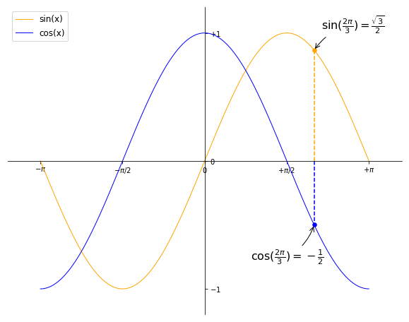
为特殊点添加注释
3.1.2. 各类参数的表示
3.1.2.1. 尺寸
为了理解 matplotlib 中的尺寸先关参数,先介绍几个基本概念:
- inch,英寸,1英寸约等于 2.54cm,它是永恒不变的。
- point,点,缩写为 pt,常用于排版印刷领域。字体大小常称为“磅”,“磅”指的是 point 的音译发音,正确的中文译名应为“点”或“点数”,和重量单位没有任何关系。它是一种固定长度的度量单位,大小为1/72英寸,1 inch = 72 points。A4 纸宽度为 8.27 英寸,595 pt。
- pixel,像素,缩写为 px。像素有两个概念,图片中的像素,它是一个bits序列,比如bmp文件中一个8bits 的0-255的灰度值描述了一个像素点,没有物理大小。 另一个概念是指显示屏或者摄像机的像素,一个像素由RGB 3个显示单元组成,它的物理大小并不是一样的,它的尺寸不是一个绝对值。计算机显示屏可以调整屏幕分辨率,其实是通过算法转换的,比如用四个像素表示原一个像素,那么垂直和水平分辨率就各降低了一半。
- 分辨率/屏幕分辨率:横纵2个方向的像素(pixels)数量,常见取值 1024*768 ,1920*1080。在Windows中 一张基于存储像素值的图片(例如BMP,PNG,JPG等格式)的分辨率也可以这样表示。
- 图像分辨率:在图像处理领域,图像分辨率是指每英寸图像内的像素点数。它的单位是 PPI(像素每英寸,pixels per inch),图像分辨率参数通常用于照相机和摄影机等摄录设备,而不是图片本身,图片本身只有像素,而像素在1:1比例下查看,对应显示设备的1个像素。
- DPI(Dots Per Inch),打印分辨率,也称为打印精度,单位每英寸点数。也即每英寸打印的墨点数,普通喷墨打印机在 300-500 DPI,激光打印机可以达到 2000 DPI。
了解了这些概念,我们就可以理解几种常见情况了:
0.图片中dpi和图像分辨率
我们已经强调,图像分辨率参数通常用于照相机和摄影机等摄录设备,而不是图片本身。但是很多图片格式,例如 jpg 文件通过 windows 可以查看文件属性中有 96 dpi 字样,又是什么意思呢?
参考 图片DPI,图片中的 dpi 值保存在图片文件格式头部的某个字段,它仅仅是一个数值,用于被某些设备读取做图片处理的参考,例如打印机,在打印时每英寸打印多少个像素点。
JPG, PNG, TIF, BMP 和 ICO 均支持设置图片文件的 dpi 参数。该参数不影响图片的分辨率,分辨率与像素数量有关。
1.图片像素和屏幕显示大小
一张图片在屏幕上显示的大小是由图片像素数和屏幕尺寸以及屏幕分辨率共同决定。例如一张图片分辨率是640x480,这张图片在屏幕上默认按1:1显示,水平方向有640个像素点,垂直方向有480个像素点。
14英寸的16:9屏幕,也即显示屏对角线长度 35.56cm = 14 inch * 2.54cm/inch,屏幕宽高比为 16 : 9,根据勾股定理宽和高约为 31cm 和 17.4cm,如果分比率为 1920 * 1080,则图像显示宽度 640 / 1920 * 31 = 10.33cm,高度为 480 /1080 * 17.4 = 7.73cm。
如果分辨率是 1600*900,则显示的图片尺寸约为 640 / 1600 * 31 = 12.40cm 和 480 / 900 * 17.4 = 9.28cm。
0 1 2 3 4 5 6 7 | def scatter_create_test_graph():
plt.figure(figsize=(6.4, 4.8), dpi=100)
ax.set_ylim(0, 2)
ax.set_xlim(0, 2)
plt.xticks([0, 1, 2])
plt.yticks([0, 1, 2])
plt.scatter(1, 1)
plt.savefig(filename="test.jpg", format='jpg', facecolor='orange')
|
以上代码生成一张640*480的JPG图片,背景为橘黄色。
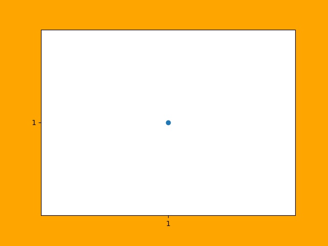
一张 640 * 480 的JPG图片
上图是一张640*480的JPG图片,为了避免网页对图片缩放,可以先保存它并用画图编辑器在**不缩放**的情况下查看它,根据电脑显示屏的分辨率来换算它的宽和高,然后对比用尺子在屏幕上测量的结果,大小是一定不会错的。
总结:1:1显示时,图片的像素点和屏幕的像素点是一一对应的,在同一台设备上,图片分辨率越高(图片像素越多),图片显示面积越大;图片分辨率越低,图片显示面积越小。对于同一张图片,屏幕分辨率越高,显示越小,屏幕分辨率越低,显示越大。对图片进行放大或者缩小显示时,计算机通过算法对图像进行了像素补足或者压缩。
图像是否清晰与图像分辨率有关。显示器是否能显示清晰的图片需同时考虑屏幕尺寸和分辨率大小,屏幕尺寸相同时,分辨率越高显示越清晰。
2.图片像素和打印
DPI(Dots Per Inch),打印分辨率用于描述打印精度,这里的 Dot 对于使用计算机打印图片来讲就是 Pixel。也即用一个打印墨点打印一个图像像素。通常 300 DPI是照片打印的标准。
照片规格通常用“寸”表示,它是指照片长方向上的边长英寸数,一般四舍五入取整数表示。
| 照片规格 | 英寸表示 | 厘米 | 图片像素(最低) |
|---|---|---|---|
| 5寸 | 5 * 3 | 12.7 * 8.9 | 1200 * 840 |
| 6寸 | 6 * 4 | 15.2 * 10.2 | 1440 * 960 |
| 7寸 | 7 * 5 | 17.8 * 12.7 | 1680 * 1200 |
| 8寸 | 8 * 6 | 20.3 * 15.2 | 1920 * 1440 |
| 10寸 | 10 * 8 | 25.4 * 20.3 | 2400 * 1920 |
| 12寸 | 12 * 10 | 30.5 * 20.3 | 2500 * 2000 |
| 15寸 | 15 * 10 | 38.1 * 25.4 | 3000 * 2000 |
图片像素的要求为何是最低呢?因为当图片过大时,打印驱动会帮我们压缩像素来适应打印机的DPI要求,但是如果图片像素不足于一个像素对应一个墨点,驱动就要进行像素插值,导致图片模糊。
3.matplotlib中的dpi,matplotlib 不是打印机,为何需要 DPI 参数?实际上在 matplotlib 中,figure 对象被当作一张打印纸,而 matplotlib 的绘图引擎(backend)就是打印机。
图片的数字化,也即将图片存储为数据有两种方案:
- 位图,也被称为光栅图。即是以自然的光学的眼光将图片看成在平面上密集排布的点的集合。每个点发出的光有独立的频率和强度,反映在视觉上,就是颜色和亮度。这些信息有不同的编码方案,最常见的就是RGB。根据需要,编码后的信息可以有不同的位(bit)数——位深。位数越高,颜色越清晰,对比度越高;占用的空间也越大。另一项决定位图的精细度的是其中点的数量。一个位图文件就是所有构成其的点的数据的集合,它的大小自然就等于点数乘以位深。位图格式是一个庞大的家族,包括常见的JPEG/JPG, GIF, TIFF, PNG, BMP。
- 矢量图。它记录其中展示的模式而不是各个点的原始数据。它将图片看成各个“对象”的组合,用曲线记录对象的轮廓,用某种颜色的模式描述对象内部的图案(如用梯度描述渐变色)。比如一张留影,被看成各个人物和背景中各种景物的组合。这种更高级的视角,正是人类看世界时在意识里的反映。矢量图格式有CGM, SVG, AI (Adobe Illustrator), CDR (CorelDRAW), PDF, SWF, VML等等。
matplotlib 支持将图像保存为 eps, jpeg, jpg, pdf, pgf, png, ps, raw, rgba, svg, svgz, tif, tiff 格式。如果要生成 jpg 文件就相当于“打印”一张图像到 figure 打印纸上。
matplotlib 在“打印”位图时需要 DPI 来指示如何把逻辑图形转换为像素。打印纸的大小由 figsize 参数指定,单位 pt(point),这与现实中的纸张单位一致,而 dpi 参数决定了在 1 inch (72pts) 要生成的像素数。
0 | plt.figure(figsize=(6.4, 4.8), dpi=100)
|
如果 dpi 为 72,那么一个 point 就对应 jpg 中的一个 pixel,如果 dpi 为 100,则一个 point 对应 jpg 中的 100/72 pixels。注意这里没有尺寸(位图图像无法用尺寸描述,只能用分辨率描述)的对应关系,只有个数的对应关系。
以下关系总是成立:
0 | 1 point == fig.dpi/72 pixels
|
matplotlib 在生成矢量图时总是使用72dpi,而忽略用户指定的dpi参数,矢量图中只保存宽和高,也即figsize参数,单位pt。
0 1 2 | <svg height="345pt" version="1.1" viewBox="0 0 460 345"
width="460pt" xmlns="http://www.w3.org/2000/svg"
xmlns:xlink="http://www.w3.org/1999/xlink">
|
一张 figsize=(6.4, 4.8) 参数生成的 svg 图片文件中指定了宽 width = 6.4 * 72 = 460pt,高 height = 4.8 * 72 = 345pt。即便我们认为指定了 dpi = 100,生成的 svg 图片的宽高不会有任何改变。
dpi对生成位图的影响
我们知道 fig.dpi 参数对矢量图的大小没有影响,而对位图有影响。考虑如下两张图片:
plt.figure(figsize=(5, 4), dpi=72)
plt.figure(figsize=(10, 8), dpi=36)
图片的宽和高像素数是一致的,但是 dpi = 72 时图片明显清晰,所以 dpi 参数会影响图片中的字体大小和线条粗细,当 dpi 小时,系统会选择小字体和细线条,dpi 大时则相反。
3.1.2.2. point 和 pixel
由于以下关系总是成立,强烈建议将 fig.dpi 设置为 72,并保存为 svg 矢量格式,这会为处理一些关于尺寸的函数参数提供方便。此时计算时生成图片时这些参数就会直接对应(从屏幕上观察)到生成的图片上的元素的长宽或者字体大小上。
0 | 1 point == fig.dpi/72 pixels
|
这些参数包括 markersize,linewidth,markeredgewidth,scatter中的 s 参数和坐标系统相关参数,例如注释的相对坐标 textcoords。
这些参数的单位通常为 points。唯一例外的是 scatter() 函数中的 s 参数。
s 参数可以为一个标量或 array_like,shape(n,),指定绘制点的大小,默认值 rcParams [‘lines.markersize’]^2。注意这里的平方,所以 s 是指的标记所占面积的像素数。
0 1 2 3 4 5 6 7 8 9 10 11 12 13 14 15 16 | plt.figure(figsize=(8,4), dpi=72)
plt.plot([0],[1], marker="o", markersize=30)
plt.plot([0.2, 1.8], [1, 1], linewidth=30)
plt.scatter([2],[1], s=30**2)
plt.annotate('plt.plot([0],[1], marker="o", markersize=30)',
xy=(0, 1), xycoords='data',
xytext=(0, 70), textcoords='offset points',fontsize=12,
arrowprops=dict(arrowstyle="->", connectionstyle="arc3,rad=.2"))
......
plt.rcParams['font.sans-serif']=['SimHei']
plt.rcParams['axes.unicode_minus'] = False # 解决保存图像时,负号'-'显示为方块问题
plt.annotate('ABC123abc 30号中文字体', xy=(0.2, 1), xycoords='data',
xytext=(-10,-10), textcoords='offset pixels', fontsize=30)
plt.savefig(filename="markersize.svg", format='svg')
|

scatter 中的 s 参数和 plot 中的 markersize 参数关系
由上图可以得到以下几点结论:
- scatter 中的 s 参数和 plot 中的 markersize 参数关系为,s = markersize^2,markersize = linewidth。
- s 是指的标记所占面积的像素数。所以可以开根号求出高度或者宽度的 point 值。
- markersize 和 linewidth 单位均是 points,当 dpi 设置为 72 时,它们的单位等同于 pixels。
- 可以看到字体大小 fontsize 单位是 points,和 markersize ,linewidth 是一致的。
- dpi 设置为 72 时,textcoords=’offset points’ 和 textcoords=’offset pixels’ 是等价的。
如果 dpi 设置超过 72,相对于生成的像素增多,图片显示出来会增大,否则显示会变小。
生成的图像分辨率就是 fig.dpi,Windows 中显示的分辨率为图像的宽和高,对应 dpi * figsize。
3.1.2.3. 颜色
颜色参数通常为 color 或者 c,它们有几种形式,参考 线条的颜色。在不同的函数中,它们格式基本是通用的。
3.1.2.4. marker
标记,marker,可以使用 marker 标记坐标点。所有标记如下:
标记缩写 描述 ‘.’ point marker ‘,’ pixel marker ‘o’ circle marker ‘v’ triangle_down marker ‘^’ triangle_up marker ‘<’ triangle_left marker ‘>’ triangle_right marker ‘1’ tri_down marker ‘2’ tri_up marker ‘3’ tri_left marker ‘4’ tri_right marker ‘s’ square marker ‘p’ pentagon marker ‘*’ star marker ‘h’ hexagon1 marker ‘H’ hexagon2 marker ‘+’ plus marker ‘x’ x marker ‘D’ diamond marker ‘d’ thin_diamond marker ‘|’ vline marker ‘_’ hline marker
各类标记对应的图形
matplotlib.markers.MarkerStyle 类定义标记和标记的各种样式。可以看到 1-11 个数字也可作为标记,它们表示的图形中心不对应坐标点,而是图形的一个边对应坐标点。
0 1 2 3 4 5 6 | # print(mpl.markers.MarkerStyle().markers) # 所有支持的标记
print(mpl.markers.MarkerStyle().filled_markers) # 可填充的标记
print(mpl.markers.MarkerStyle().fillstyles) # 填充类型
>>>
('o', 'v', '^', '<', '>', '8', 's', 'p', '*', 'h', 'H', 'D', 'd', 'P', 'X')
('full', 'left', 'right', 'bottom', 'top', 'none')
|
支持填充的标记使用不同填充样式对应的图形
3.1.3. matplotlib各类对象
在 Matplotlib 里面:
- figure(plt.Figure 类的一个实例)可以被看成是一个能够容纳各种坐标轴、图形、文字和标签的容器,好比作画的画布,或者一张打印纸。
- axes(plt.Axes 类的一个实例) 是一个带有刻度和标签的矩形,最终会包含所有可视化的图形元素。
通常会用变量 fig 表示一个图形实例,用变量 ax 表示一个坐标轴实例或一组坐标轴实例。创建好坐标轴之后, 就可以用 ax.plot 画图了。
0 1 2 3 4 5 6 | fig = plt.figure()
ax = plt.axes()
x = np.linspace(0, np.pi*4, 256)
ax.plot(x, np.sin(x));
plt.plot(x, np.cos(x));
plt.show()
|
也可以使用 plt.plot() 来作图,它对 ax.plot() 进行了封装。如果要在 figure 上创建多个图像元素,只要重复调用 plot 等画图命令即可。
使用ax对象和plt.plot绘图
3.1.3.1. 坐标轴
关闭坐标轴标签:
0 1 | plt.xticks([]) # 关闭 x 轴标签
plt.yticks([]) # 关闭 y 轴标签
|
关闭X轴和Y轴标签
关闭坐标轴将同时关闭标签:
0 | plt.axis('off')
|
关闭坐标轴
以下操作等价于关闭 x/y 轴标签:
0 1 2 | frame = plt.gca() # get current axis
frame.axes.get_yaxis().set_visible(False) # y 轴不可见
frame.axes.get_xaxis().set_visible(False) # x 轴不可见
|
注意,类似的这些操作需要将其置于 plt.show() 之前 plt.imshow() 之后。
设置坐标轴区间:
0 1 | plt.xlim(xmin, xmax) #设置坐标轴的最大最小区间
plt.ylim(ymin, ymax)#设置坐标轴的最大最小区间
|
设置图形标签:
0 1 2 3 | plt.plot(x, np.sin(x))
plt.title("A Sine Curve") # 坐标轴标题
plt.xlabel("x") # x 轴标签
plt.ylabel("sin(x)") # y 轴标签
|
3.1.4. annotate注释
annotate() 注释可以将文本放于任意坐标位置。
matplotlib.pyplot.annotate(s, xy, *args, **kwargs)
s,要注释的文本字符串
xy,(float, float) 要注释的坐标
xycoords,指定 xy 坐标系统,默认 data。
xytext,(float, float),注释要放置的坐标,如果不提供则使用 xy。textcoords 参数指定 xytext 如何使用。
textcoords,指定 xytext 坐标与 xy 之间的关系。如果不提供,则使用 xycoords。
ha /horizontalalignment,水平对齐,和点 xy 的水平对齐关系。取值 ‘center’, ‘right’ 或 ‘left’。
va /verticalalignment,垂直对齐,和点 xy 的垂直对齐关系。取值 ‘center’, ‘top’, ‘bottom’, ‘baseline’ 或 ‘center_baseline’。
**kwargs 参数可以是 matplotlib.text.Text 中的任意属性,例如 color。
xycoords 值 坐标系统 ‘figure points’ 距离图形左下角点数 ‘figure pixels’ 距离图形左下角像素数 ‘figure fraction’ 0,0 是图形左下角,1,1 是右上角 ‘axes points’ 距离轴域左下角的点数量 ‘axes pixels’ 距离轴域左下角的像素数量 ‘axes fraction’ 0,0 是轴域左下角,1,1 是右上角 ‘data’ 使用轴域数据坐标系 ‘polar’ 极坐标 textcoords 取值 描述 ‘offset points’ 相对于 xy 进行值偏移(inch) ‘offset pixels’ 相对于 xy 进行像素偏移
3.1.4.1. 注释位置
0 1 2 3 4 5 6 7 8 9 10 11 12 13 14 15 16 17 18 19 20 21 22 23 24 25 26 27 28 29 30 31 32 33 34 35 36 37 38 39 40 41 42 43 44 45 46 47 48 | def annotate():
fig = plt.figure(dpi=72, facecolor='#dddddd')
ax = fig.add_subplot(111, autoscale_on=False, xlim=(-1, 5), ylim=(-3, 5))
plt.rcParams['font.sans-serif']=['SimHei']
t = np.arange(0.0, 5.0, 0.01)
s = np.cos(2 * np.pi * t)
line, = ax.plot(t, s)
# 相对于图像最左下角的偏移像素数,未提供xytext,则表示注释在xy点
ax.annotate('1.figure pixels',
xy=(0, 0), xycoords='figure pixels', color='r', fontsize=16)
# 相对于图像最左下角的偏移点数,由于 dpi=72,这里与'figure pixels' 效果相同
ax.annotate('2.figure points',
xy=(0, 50), xycoords='figure points', color='r', fontsize=16)
# 使用轴域数据坐标系,也即 2,1 相对于坐标原点 (0,0),注释位置再相对于xy 偏移 xytext
ax.annotate('3.data',
xy=(2, 1), xycoords='data',
xytext=(-15, 25), textcoords='offset points',
arrowprops=dict(facecolor='black', shrink=0.05),
horizontalalignment='right', verticalalignment='top',
color='r')
# 整个图像的左下角为 0,0,右上角为1,1,xy 在[0-1] 之间取值
ax.annotate('4.figure fraction',
xy=(0.0, .95), xycoords='figure fraction',
horizontalalignment='left', verticalalignment='top',
fontsize=16, color='r')
# 0,0 是轴域左下角,1,1 是轴域右上角
ax.annotate('5.axes fraction',
xy=(3, 1), xycoords='data',
xytext=(0.8, 0.95), textcoords='axes fraction',
arrowprops=dict(facecolor='black', shrink=0.05),
horizontalalignment='right', verticalalignment='top',
color='r')
# xy被注释点使用轴域偏移 'axes fraction', xytext使用相对偏移
ax.annotate('6.pixel offset from axes fraction',
xy=(1, 0), xycoords='axes fraction',
xytext=(-20, 20), textcoords='offset pixels',
horizontalalignment='right',
verticalalignment='bottom', color='r')
plt.show()
|
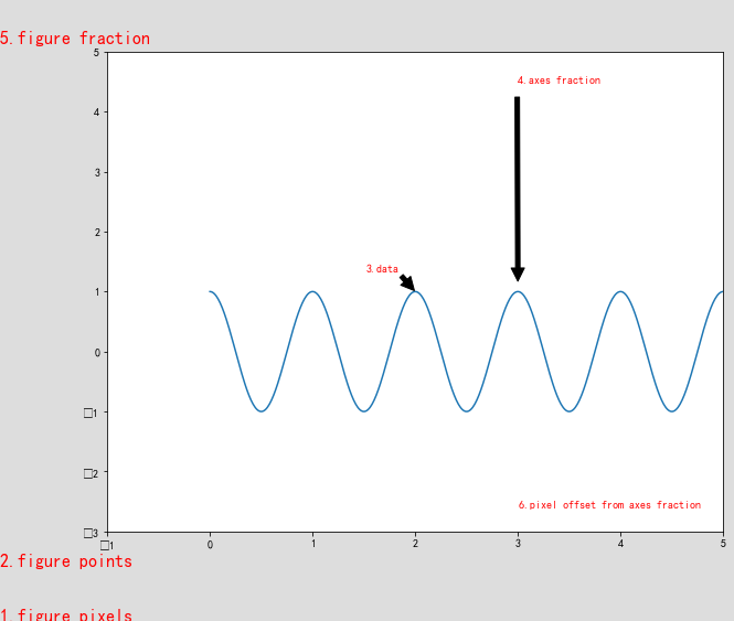
使用各类坐标系统进行注释
对于上图,有几点需要说明:
- matplotlib 中有两个区域,图形区域(整个图形区域,包括灰色和白色两部分);轴域,上图中的白色部分。
- 每个区域有自己的坐标系统,左下角均为 (0, 0),可以使用点或者像素偏移,或者指定 fraction 坐标,此时右上角坐标值为 (1,1),整个区域的坐标用[0-1]之间的小数表示。
- xycoords 值中 ‘figure points’ 和 ‘figure pixels’ 相对于图形区域左下角偏移点和像素数。
- xycoords 值中 ‘figure fraction’ 直接指定图形区域的 fraction 小数坐标 。
- xycoords 值中 ‘axes points’,’axes pixels’ 和 ‘axes fraction’ 类似。
- xycoords 值中 ‘data’ 指定使用轴域数据坐标系。
3.1.4.2. 坐标点注释
0 1 2 3 4 5 6 7 8 9 | def scatter_create_annotate_graph():
x = np.array([i for i in range(10)])
y = [0,1,2,3,4,4,3,2,1,0]
plt.figure(figsize=(10,10))
plt.scatter(x, y, marker='s', s = 50)
for x, y in zip(x, y):
plt.annotate('(%s,%s)'%(x,y), xy=(x,y), xytext=(0, -5),
textcoords = 'offset pixels', ha='left', va='top')
plt.show()
|
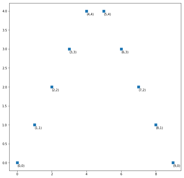
对坐标点进行注释
3.1.4.3. 添加箭头
可以通过参数 arrowprops 在注释文本和注释点之间添加箭头。
| arrowprops属性 | 描述 |
|---|---|
| width | 箭头的宽度,以点为单位 |
| frac | 箭头的头部所占据的比例 |
| headwidth | 箭头的头部宽度,以点为单位 |
| shrink | 收缩箭头头部和尾部,使其离注释点和注释文本多一些距离 |
0 1 2 3 4 5 6 7 8 9 10 11 12 13 14 15 16 17 18 19 20 21 22 23 24 25 26 27 28 | def annotate_arrow():
plt.figure(dpi=72)
plt.xticks([0, 1, 2, 3], ['width','headwidth','shrink',''], fontsize=16)
plt.yticks([0, 1, 1.4], ['']*3)
ax = plt.gca()
ax.spines['left'].set_color('none')
ax.spines['top'].set_color('none')
ax.spines['bottom'].set_color('none')
ax.spines['right'].set_color('none')
# 调整箭头的宽度
for i in [1, 2, 4, 6, 8, 10]:
plt.annotate('annotate' + str(i), xy=(0, i/8), xycoords='data',
arrowprops=dict(facecolor='black', shrink=0.0, width=i, headwidth=20),
xytext=(50, i/8), textcoords='offset pixels', fontsize=16)
# 调整箭头的箭头宽度
for i in [1, 2, 4, 6, 8, 10]:
plt.annotate('annotate' + str(i), xy=(1, i/8), xycoords='data',
arrowprops=dict(facecolor='r', edgecolor='r', shrink=0.0,
width=3, headwidth=i*2),
xytext=(50, i/8), textcoords='offset pixels', fontsize=16)
# 调整箭头的收缩比
for i in [1, 2, 4, 6, 8, 10]:
plt.annotate('annotate' + str(i), xy=(2, i/8), xycoords='data',
arrowprops=dict(facecolor='m', edgecolor='m', shrink=0.01 * i,
width=3, headwidth=20),
xytext=(50, i/8), textcoords='offset pixels', fontsize=16)
plt.show()
|
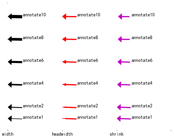
调节箭头各个参数的效果图
3.1.5. 绘图风格
可以通过 plt.style 设置绘图风格,它们存放在 plt.style.available 列表中。
0 1 2 3 4 5 | print(mpl.__version__)
print(plt.style.available[:5])
>>>
2.0.2
['bmh', 'classic', 'dark_background', 'fivethirtyeight', 'ggplot']
|
在 matplotlib 2.0.2 版本上支持 23 中不同的绘图风格。
如果要恢复默认的绘图风格,请使用 mpl.rcParams.update(mpl.rcParamsDefault)。
0 1 2 3 4 5 6 7 8 9 10 | #plt.style.use('classic') # 定义全局绘图风格
plt.figure(figsize=(16,25), dpi=72)
index = 1
for style in plt.style.available:
with plt.style.context(style): # 使用绘图风格上下文
plt.subplot(6,4,index)
plt.plot([1,2])
plt.scatter(1,2)
plt.title('Style{}:'.format(index) + style)
index+=1
plt.show()
|
如果使用 plt.style.use(style) 则作用到全局,使用绘图风格上下文管理器(context manager) plt.style.context(style) 临时切换绘图风格。
一些知名的常用绘图风格:
- classic,matplotlib 仿照 matlab 的经典风格。
- FiveThirtyEight 风格模仿著名网站 FiveThirtyEight(http://fivethirtyeight.com) 的绘图风格。
- ggplot风格,R 语言的 ggplot 是非常流行的可视化工具。
- bmh风格,源于在线图书 Probabilistic Programming and Bayesian Methods for Hackers(http://bit.ly/2fDJsKC)。整本书的图形都是用 Matplotlib 创建的, 通过一组 rc 参数创建了一种引人注目的绘图风格,它被 bmh 风格继承了。
- dark_background 风格:用黑色背景而非白色背景往往会取得更好的效果。它就是为此设计的。
- grayscale 灰度风格:有时可能会做一些需要打印的图形,不能使用彩色。 这时使用它效果最好。
- Seaborn 系列风格,灵感来自 Seaborn 程序库,Seaborn 程序对 Matplotlib 进行了高层的API封装,从而使得作图更加容易。seaborn-whitegrid 带网格显示。
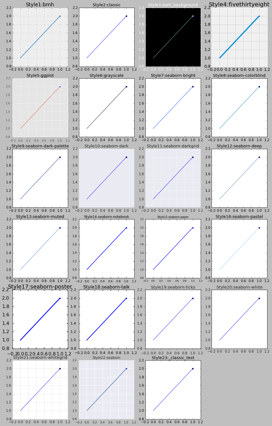
不同绘图风格效果图
3.1.5.1. 带网格作图
0 1 2 3 | plt.style.use('seaborn-whitegrid')
fig = plt.figure()
ax = plt.axes() # 绘制坐标轴
plt.show()
|
seaborn-whitegrid 风格常用来绘制带网格的图。
带网格的作图风格
3.2. 绘制散点图
3.2.1. plot
plt.plot 通常用来绘制线形图,但是它同样可以绘制散点图。
0 1 2 3 4 5 | fig = plt.figure(figsize=(6,4))
x = np.linspace(0, 10, 30)
y = np.sin(x)
# 等价于 plt.plot(x, y, mark='o', color='blue')
plt.plot(x, y, 'ob')
|
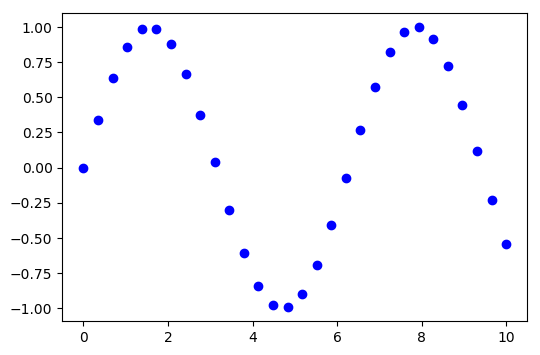
plot 绘制散点图
这里把 linestyle 参数改为 mark,参考 marker。当然我们依然可以指定线型,这样可以绘制线条和散点的组合图:
0 1 | # 把散点用线条连接
plt.plot(x, y, '-ob')
|
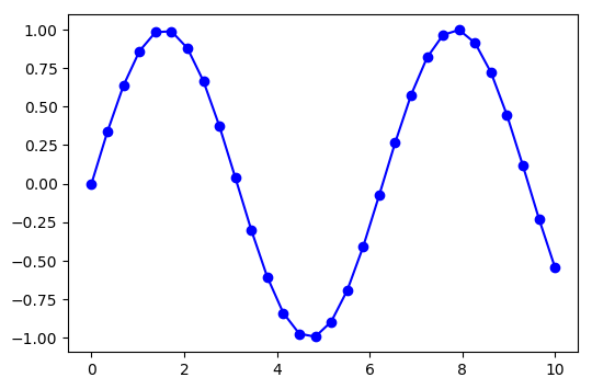
plot 绘制线条和散点图
plt.plot 支持许多设置线条和散点属性的参数:
0 1 2 3 4 | plt.plot(x, y, '-H', color='gray', # 线条颜色
markersize=15, linewidth=4, # 标记大小,线宽
markerfacecolor='white', # 标记填充色
markeredgecolor='gray', # 标记边框色
markeredgewidth=2) # 标记边框宽度
|
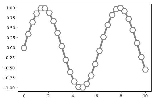
plot 设置线条和散点属性
3.2.2. scatter
plt.scatter 与 plt.plot 的主要差别在于, 前者在创建散点图时具有更高的灵活性, 可以单独控制每个散点与数据匹配, 也可以让每个散点具有不同的属性(大小、 表面颜色、 边框颜色等) 。
scatter(x, y, s=None, c=None, marker=None, cmap=None, norm=None, vmin=None, vmax=None,
alpha=None, linewidths=None, verts=None, edgecolors=None,
hold=None, data=None, **kwargs)
scatter() 专门用于绘制散点图,提供默认值的参数可选,各个参数意义如下:
- x, y:array 类型,shape(n,),输入的坐标点。
- s :标量或 array_like,shape(n,),指定绘制点的大小,默认值 rcParams [‘lines.markersize’]^2。
- c:可以为单个颜色,默认:’b’,可以是缩写颜色的字符串,比如 ‘rgb’,或者颜色序列 [‘c’, ‘#001122’, ‘b’],长度必须与坐标点 n 相同。
- marker:默认值:’o’,可以为标记的缩写,也可以是类 matplotlib.markers.MarkerStyle 的实例。参考 marker。
- linewidths:标记外边框的粗细,当个值或者序列。
- alpha:透明度,0 - 1.0 浮点值。
- edgecolors:标记外边框颜色,单个颜色,或者颜色序列。
0 1 2 3 4 5 6 7 8 9 10 | def scatter_create_color_graph():
x = [i for i in range(20)]
y = [i for i in range(20)]
plt.figure(figsize=(10, 8), dpi=72)
plt.xticks(x)
plt.yticks(y)
c = np.linspace(0, 0xffffff, 20, endpoint=False)
plt.scatter(x, y, c=c, s=200, marker='o')
plt.show()
|
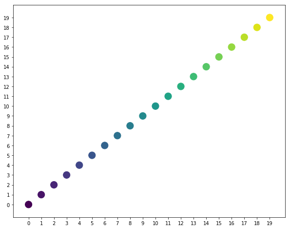
不同颜色值绘制的散点图
0 1 2 3 4 5 6 7 8 9 10 | def scatter_create_markers_graph():
x = np.array([i for i in range(20)])
y = np.array([i for i in range(20)])
plt.figure(1)
plt.xticks(x)
plt.yticks(y)
plt.scatter(x, y, c='orange', s=200, marker='v')
plt.scatter(x + 1, y, c='gray', s=100, marker='^')
plt.show()
|
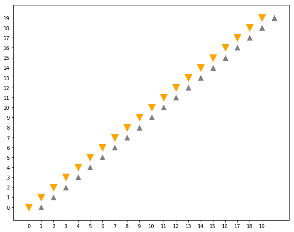
不同标记大小和颜色绘制的散点图
0 1 2 3 4 5 6 7 8 9 10 11 12 13 | def scatter_create_size_graph():
x = np.array([i for i in range(10)])
y = np.array([0] * len(x))
plt.figure(1)
plt.ylim(-0.5, 1.5)
plt.yticks([0, 1])
plt.xticks(x)
sizes = [20 * (n + 1) ** 2 for n in range(len(x))]
plt.scatter(x, y, c='m', s=sizes)
sizes = [20 * (10 - n) ** 2 for n in range(len(x))]
plt.scatter(x, y + 1, c='m', s=sizes)
plt.show()
|
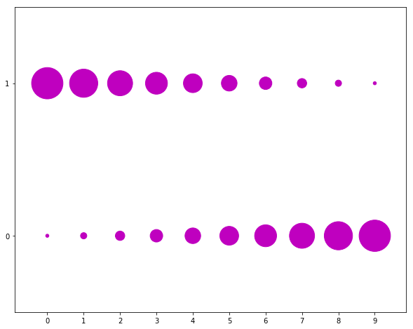
根据坐标调整标记大小
0 1 2 3 4 5 6 | def scatter_create_random_graph():
x = np.random.randn(100)
y = np.random.randn(100)
plt.figure(1)
plt.scatter(x, y, c='m', marker='p', s=500, alpha=0.6)
plt.show()
|
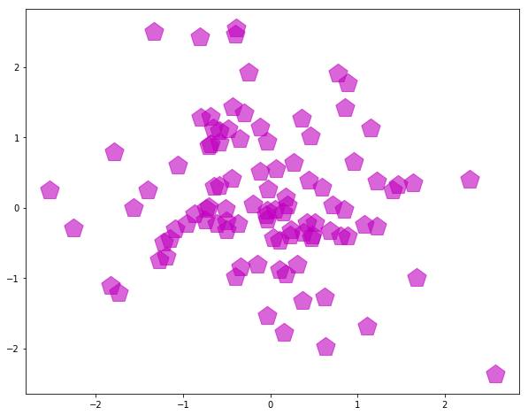
随机坐标散点图
0 1 2 3 4 5 6 7 8 9 | def scatter_create_guess_graph():
mu_vec = np.array([0,0])
cov_mat = np.array([[1,0],[0,1]])
X = np.random.multivariate_normal(mu_vec, cov_mat, 1000)
R = X ** 2
R_sum = R.sum(axis = 1)
plt.figure(1)
plt.scatter(X[:,0], X[:,1], color='m', marker='o',
s = 32.*R_sum, edgecolor='black', alpha=0.5)
plt.show()
|
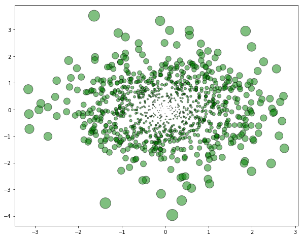
多元高斯分布二维图
0 1 2 3 4 5 6 7 8 9 10 | def scatter_create_gradual_graph():
plt.figure(1)
c = np.linspace(0xffff00, 0xffffff, 20, endpoint=False)
for i in range(19,-1,-1):
size = i * 10000 + 10
cval = hex(int(c[i]))[2:]
color = "#" + '0' * (6 - len(cval)) + cval
plt.scatter(0, 0, s=size, c=color)
plt.show()
|
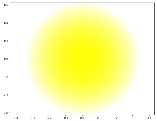
同点渐变晕化
由于 plt.scatter 会对每个散点进行单独的大小与颜色的渲染, 因此渲染器会消耗更多的资源。 而在 plt.plot 中, 散点基本都彼此复制,因此整个数据集中所有点的颜色、 尺寸只需要配置一次。当绘制非常多的点时优先选用 plt.plot。
3.3. 条形图
条形图又称为柱状图,是一种直观描述数据量大小的图。
3.3.1. 垂直条形图
plt.bar 用于画条形图,有以下参数:
- x: 条形图 x 轴坐标,y:条形图的高度
- width:条形图的宽度 默认是0.8
- bottom:条形底部的 y 坐标值 默认是0
- align:center 或 edge,条形图对齐 x 轴坐标中心点还是对齐 x 轴坐标左边缘作图。
0 1 2 3 4 5 6 7 8 | # 条形图宽 0.1,填充色 grey
plt.bar([1], [2], width=0.1, facecolor='grey')
# 条形图宽 0.2,填充色 white,边框颜色 black
plt.bar([2], [3], width=0.2, facecolor='w', edgecolor='black')
# 左对齐
plt.bar([3], [3], width=0.2, align='edge', facecolor='y')
# 画多个条形图,底部抬升 1
plt.bar([4,5], [2,2], bottom=1, width=0.2, facecolor='m')
plt.show()
|
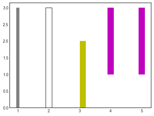
条形图
我们可以为条形图添加标签和文本说明:
0 1 2 3 4 5 6 7 8 9 10 11 | name_list = ['John','Lily','Bill','Tom']
score_list = [80, 90, 78, 95]
# tick_label 参数指定标签列表
bars = plt.bar([1,2,3,4], score_list, color='grey', width=0.4, tick_label=name_list)
# plt.text 在指定坐标添加文本,居中标注
for bar in bars:
height = bar.get_height()
plt.text(bar.get_x() + bar.get_width() / 2, height, str(int(height)),
ha="center", va="bottom")
plt.show()
|
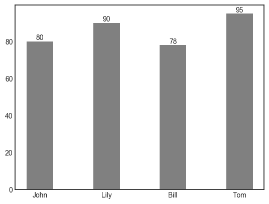
添加标签和文本
3.3.2. 堆叠条形图
堆叠的关键操作在 bottom 参数,堆叠在 bottom 之上:
0 1 2 3 4 5 6 7 8 9 10 11 12 13 14 15 16 17 | name_list = ['John','Lily','Bill','Tom']
lang_scores = [80, 90, 78, 95]
math_scores = [92, 88, 90, 93]
x = np.arange(1,5,1)
lang_bars = plt.bar(x, lang_scores, color='y', width=0.4, tick_label=name_list,
label='Language')
math_bars = plt.bar(x, math_scores, bottom=lang_scores, width=0.4,
label='Mathmatics', tick_label = name_list)
for i,j in zip(lang_bars, math_bars):
height = i.get_height() + j.get_height()
plt.text(i.get_x() + i.get_width() / 2, height, str(int(height)),
ha="center", va="bottom")
plt.ylim(0, 220)
plt.legend(loc='upper left')
plt.show()
|
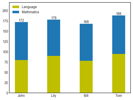
堆叠条形图
3.3.3. 并列条形图
并列条形图的关键在于调整第二个条形图的 x 坐标,它等于第一个条形图的坐标加上它的宽度的1/2,再加上自身的宽度的1/2,如果对齐为 edge,则要对应调整坐标:
0 1 2 3 4 5 6 7 8 9 10 11 12 13 14 | lang_bars = plt.bar(x, lang_scores, color='y', width=0.4, tick_label=name_list,
label='Language')
# 调整 x 坐标,为第一个条形图的偏移
math_bars = plt.bar([i + 0.4 for i in x], math_scores, width=0.4,
label='Mathmatics', tick_label = name_list)
for i,j in zip(lang_bars, math_bars):
plt.text(i.get_x() + i.get_width() / 2, i.get_height(), str(int(i.get_height())),
ha="center", va="bottom")
plt.text(j.get_x() + j.get_width() / 2, j.get_height(), str(int(j.get_height())),
ha="center", va="bottom")
plt.ylim(0, 120)
plt.legend(loc='upper left')
plt.show()
|
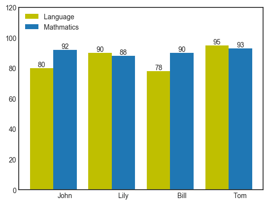
并列条形图
3.3.4. 水平条形图
水平条形图使用 plt.barh 作图,其他参数类似,注意文本标注坐标的调整:
0 1 2 3 4 5 6 7 8 9 10 11 | name_list = ['John','Lily','Bill','Tom']
score_list = [80, 90, 78, 95]
# tick_label 参数指定标签列表
bars = plt.barh([1,2,3,4], score_list, color='grey', height=0.4, tick_label=name_list)
# plt.text 在指定坐标添加文本,居中标注
for bar in bars:
height = bar.get_height()
plt.text(bar.get_width(), bar.get_y() + height / 2, str(int(bar.get_width())),
ha="left", va="center")
plt.show()
|
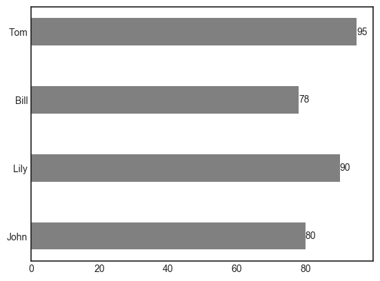
水平条形图
3.4. 饼图
饼图英文学名为 Sector Graph,又名 Pie Graph。常用于统计学。plt.pie 用于绘制饼图。
0 1 2 3 4 5 6 7 8 9 10 | plt.figure()
plt.subplot(2,2,1)
sizes = [1,2]
plt.pie(sizes)
plt.subplot(2,2,2)
plt.axis('equal') #使饼图长宽相等
sizes = [1,1,1]
plt.pie(sizes)
plt.show()
|
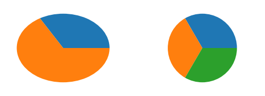
简单饼图
观察上图,可以看到 plt.pid 如何使用参数 sizes 的,它把个元素相加求出总和,然后各部分除以总和求出占比,然后按比例切分一个圆(Pie),为了使上面的饼图有意义,我们增加标签说明。
0 1 2 3 4 5 6 7 | labels = ['English', 'Maths', 'Chemistry']
scores = [90, 75, 88]
explode = (0, 0, 0.1)
plt.pie(scores, explode=explode, labels=labels,
autopct='%1.1f%%', shadow=True, startangle=60)
plt.axis('equal')
plt.legend(loc="upper right")
plt.show()
|
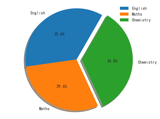
添加标签的饼图
一个详细的参数列表如下:
- x :(每一块)的比例,如果sum(x) > 1会使用sum(x)归一化;
- labels :(每一块)饼图外侧显示的说明文字;
- explode :(每一块)离开中心距离;
- startangle :起始绘制角度,默认图是从x轴正方向逆时针画起,如设定=90则从y轴正方向画起;
- shadow : 在饼图下面画一个阴影。默认值:False,即不画阴影;
- labeldistance :label标记的绘制位置,相对于半径的比例,默认值为1.1, 如<1则绘制在饼图内侧;
- autopct :控制饼图内百分比设置,可以使用format字符串,’%1.1f’ 指小数点前后位数(没有用空格补齐);
- pctdistance :类似于labeldistance,指定autopct的位置刻度,默认值为0.6;
- radius :控制饼图半径,默认值为1;
- counterclock :指定指针方向;布尔值,可选参数,默认为:True,即逆时针。将值改为False即可改为顺时针。
- wedgeprops :字典类型,可选参数,默认值:None。参数字典传递给wedge对象用来画一个饼图。例如:wedgeprops={‘linewidth’:3}设置wedge线宽为3。
- textprops :设置标签(labels)和比例文字的格式;字典类型,可选参数,默认值为:None。传递给text对象的字典参数。
- center :浮点类型的列表,可选参数,默认值:(0,0)。图标中心位置。
- frame :布尔类型,可选参数,默认值:False。如果是true,绘制带有表的轴框架。
- rotatelabels :布尔类型,可选参数,默认为:False。如果为True,旋转每个label到指定的角度。
- colors : 自定义颜色表,例如 [‘r’,’g’,’y’,’b’]。
3.5. 直方图
直方图常用于显示数据的区间分布密度,统计概率等。又称为频率直方图。
频率分布直方图中的横轴表示样本的取值,分为若干组距,纵轴表示频率/组距,所谓频率即落在组距上的样本数。
3.5.1. 一维频率直方图
plt.hist 被用来画频次直方图:
0 1 2 | plt.style.use('seaborn-white')
data = np.random.randn(500)
plt.hist(data, color='gray')
|
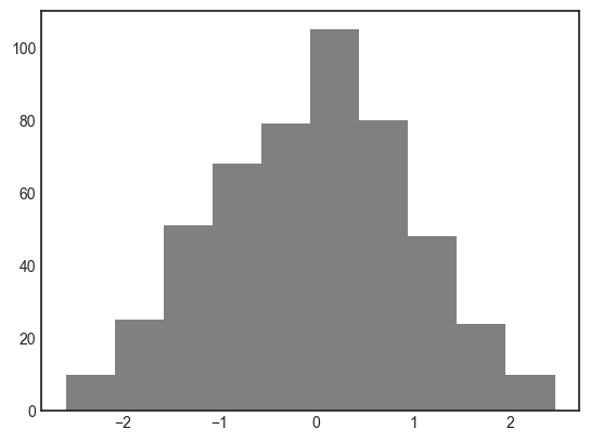
随机数直方图
hist() 有许多用来调整计算过程和显示效果的选项,例如 histtype 类型对比:
0 1 2 3 4 5 6 7 8 9 10 11 12 13 | plt.figure(figsize=(8,4))
plt.subplot(1,2,1)
plt.title('step')
# 因为 step 默认不填充,所以 edgecolor 必须存在
plt.hist(data, bins=50, normed=True, alpha=1,
histtype='step', color='grey')
plt.subplot(1,2,2)
plt.title('stepfilled')
plt.hist(data, bins=50, normed=True, alpha=1,
histtype='stepfilled', color='grey',
edgecolor='none')
|
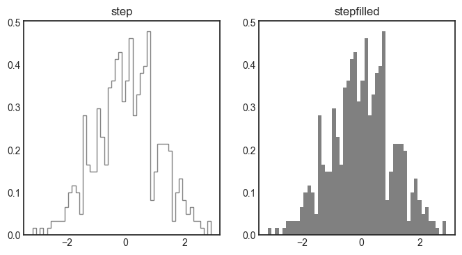
不同 histtype 类型的直方图
stepfilled 与透明性参数 alpha 搭配使用的效果非常好:
0 1 2 3 4 5 6 7 8 9 | plt.figure(figsize=(8,4))
x1 = np.random.normal(0, 2, 1000)
x2 = np.random.normal(-2, 1, 1000)
x3 = np.random.normal(2, 2, 1000)
kwargs = dict(histtype='stepfilled', alpha=0.5, normed=True, bins=40)
plt.hist(x1, **kwargs)
plt.hist(x2, **kwargs)
plt.hist(x3, **kwargs)
|
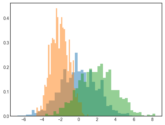
不同频次透明度直方图
np.histogram() 计算每段区间的样本数:
0 1 2 3 4 5 6 | counts, bin_edges = np.histogram([1,2,3,4,5], bins=5)
print(counts)
print(bin_edges)
>>>
[1 1 1 1 1]
[ 1. 1.8 2.6 3.4 4.2 5. ]
|
3.5.2. 二维频率直方图
我们先看一个简单示例,来理解二维频率直方图的绘图步骤。
0 1 2 | plt.hist2d([0,1,1,2],[0,2,2,1.5], bins=2, cmap='Blues')
cb = plt.colorbar()
cb.set_label('counts in bin')
|
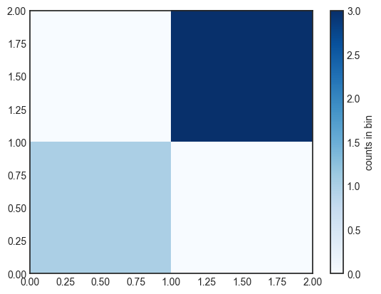
二维频率直方图
示例中给定了 4 个坐标,x 坐标范围为 [0-2],y 坐标范围也是 [0-2],bins = 2,表示均分 x 和 y 坐标范围,形成四个区域,然后统计每个区域落入的坐标点数。显然右上方深蓝区域落入 3 个点,所以右方的频率标签最大为 3,同时左下角浅蓝对应频率标签 1 处的颜色。
用一个多元高斯分布(multivariate Gaussian distribution) 生成 x 轴与 y 轴的样本数据并画2D频率图:
0 1 2 3 4 5 6 7 8 | mean = [0, 0]
cov = [[1, 1], [1, 2]]
x, y = np.random.multivariate_normal(mean, cov, 1000).T
# 画点,用于对比直方图颜色深浅
plt.plot(x,y, 'o', color='blue', markersize=1, alpha=0.5)
plt.hist2d(x,y, bins=30, cmap='Blues')
cb = plt.colorbar()
cb.set_label('counts in bin')
|
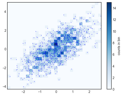
多元高斯分布二维频率直方图
通过对比点数的密集程度,可以看到点越密集的坐标处,直方图显示越深。
np.histogram2d 实现 2D 分布统计:
0 1 2 3 4 | counts, xedges, yedges = np.histogram2d(x, y, bins=30)
print(counts.shape)
>>>
(30, 30) # 所以 bins=30 将坐标划分成 30*30 个区域
|
3.5.3. 六边形区间划分
二维频次直方图是由与坐标轴正交的方块分割而成的, 还有一种常用的方式是用正六边形分割。 Matplotlib 提供了 plt.hexbin 满足此类需求, 将二维数据集分割成蜂窝状。
0 1 2 | plt.plot(x,y, 'o', color='blue', markersize=1, alpha=0.5)
plt.hexbin(x, y, gridsize=30, cmap='Blues')
cb = plt.colorbar(label='count in bin')
|
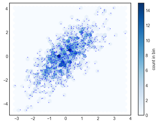
hexbin 函数画二维频次直方图
plt.hexbin 同样也有很多有趣的配置选项,包括为每个数据点设置不同的权重,以及用任意 NumPy 累计函数改变每个六边形区间划分的结果(权重均值、 标准差等指标)。
3.6. 等高线图
- plt.contour 画等高线图。
- plt.contourf 画带有填充色的等高线图(filled contour plot) 的色彩。
- plt.imshow 显示图形。
0 1 2 3 4 5 6 7 8 9 | def f(x, y):
return np.sin(x) ** 10 + np.cos(10 + y * x)
plt.style.use('seaborn-white')
x = np.linspace(0, 5, 50)
y = np.linspace(0, 5, 40)
X, Y = np.meshgrid(x, y)
Z = f(X, Y)
plt.contour(X, Y, Z, colors='black');
|
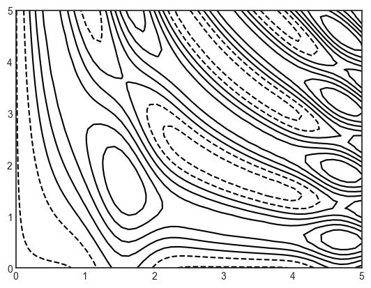
等高线图
np.meshgrid 从一维数组构建二维网格数据。 生成 shape(x.shape, y.shape) 两个矩阵,一个用 x 填充行,一个用 y 填充列:
0 1 2 3 4 5 6 7 8 9 10 11 12 13 | x = np.array([0,1,2])
y = np.array([-2,-1])
xv,yv = np.meshgrid(x,y)
print(xv)
print(yv)
>>>
[[0 1 2]
[0 1 2]]
[[-2 -2 -2]
[-1 -1 -1]]
plt.plot(xv, yv, 'o', c='grey')
|
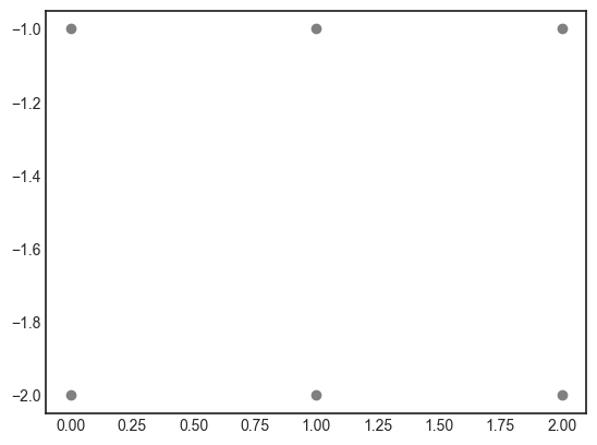
meshgrid 效果图
为了凸显图像的高度和深度,我们可以使用 cmap,并等分更多份的等高线:
0 1 | # 根据高度数据等分为 20 份,并使用 copper 颜色方案
plt.contour(X, Y, Z, 20, cmap='copper')
|
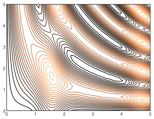
颜色标注的等高线图
Matplotlib 有非常丰富的配色方案,可以使用 help(plt.cm) 查看它们。
可以通过 plt.contourf() 函数来填充等高线图(结尾有字母f,意味 fill),它的语法和 plt.contour() 一样。plt.colorbar() 命令自动创建一个表示图形各种颜色对应标签信息的颜色条。
0 1 2 | # 亮表示波峰,暗表示波谷,是一个鸟瞰图
plt.contourf(X, Y, Z, 20, cmap='copper')
plt.colorbar()
|
颜色填充的等高线图
上面的图形是一个“梯度”的颜色填充等高线图,每一个梯度颜色相同。我们可以为梯度图添加等高线和标签:
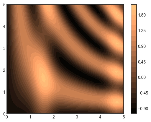
0 1 2 3 4 5 6 7 8 | # hot 是另一个常用的配色方案,对比度更强烈
plt.contourf(X, Y, Z, 20, alpha=0.75, cmap='hot')
# 画等高线
contours = plt.contour(X, Y, Z, 5, colors='black', linewidth=0.5)
# inlins 表示等高线是否穿过数字标签
plt.clabel(contours, inline=True, fontsize=10)
plt.colorbar()
|
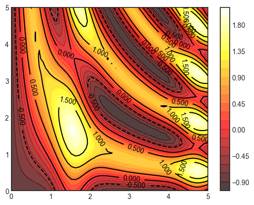
带标签的等高线图
3.7. 三维图
Matplotlib 原本只能画2D图,后来扩展了 mplot3d 工具箱,它用来画三维图。
0 | from mpl_toolkits import mplot3d
|
3.7.1. 三维数据点与线
最基本的三维图是由 (x , y , z ) 三维坐标点构成的线图与散点图。 与前面介绍的普通二维图类似, 可以用 ax.plot3D 与 ax.scatter3D 函数来创建它们。 由于三维图函数的参数与前面二维图函数的参数基本相同。
下面来画一个三角螺旋线(trigonometric spiral),在线上随机布一些散点:
0 1 2 3 4 5 6 7 8 9 10 11 12 13 14 | # 生成3d坐标
ax = plt.axes(projection='3d')
# 三维线的数据
zline = np.linspace(0, 15, 1000)
xline = 2 * np.sin(zline)
yline = np.cos(zline)
ax.plot3D(xline, yline, zline, 'r')
plt.ylim(-2, 2)
# 三维散点的数据
zdata = 15 * np.random.random(100)
xdata = 2 * np.sin(zdata) + 0.1 * np.random.randn(100)
ydata = np.cos(zdata) + 0.1 * np.random.randn(100)
ax.scatter3D(xdata, ydata, zdata, c=zdata, cmap='hot')
|
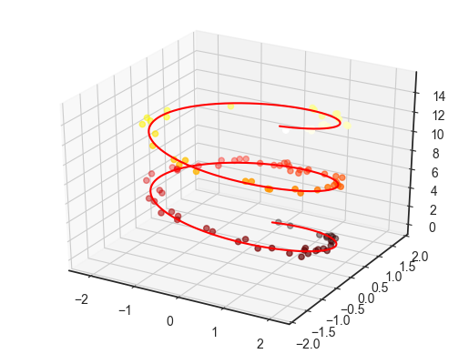
3D 螺旋线和散点图
默认情况下,散点会自动改变透明度, 以在平面上呈现出立体感。
3.7.2. 三维等高线图
mplot3d 也有用同样的输入数据创建三维晕渲(relief) 图的工具。 与二维 ax.contour 图形一样, ax.contour3D 要求所有数据都是二维网格数据的形式, 并且由函数计算 z 轴数值。
生成三维正弦函数的三维坐标点:
0 1 2 3 4 5 6 7 | def f(x, y):
return np.sin(np.sqrt(x ** 2 + y ** 2))
x = np.linspace(-6, 6, 30)
y = np.linspace(-6, 6, 30)
X, Y = np.meshgrid(x, y)
Z = f(X, Y)
|
默认的初始观察角度有时不是最优的, view_init 可以调整观察角度与方位角(azimuthal angle)。 第一个参数调整俯仰角(x-y 平面的旋转角度), 第二个参数是方位角(就是绕 z 轴顺时针旋转的度数)。
0 1 2 3 4 5 6 7 8 9 10 11 12 13 14 15 16 17 | def draw(ax, X, Y, Z):
ax.contour3D(X, Y, Z, 40, cmap='hot')
ax.set_xlabel('x')
ax.set_ylabel('y')
ax.set_zlabel('z')
fig = plt.figure(figsize=(10,8))
ax = fig.add_subplot(2, 2, 1, projection='3d')
draw(ax, X, Y, Z)
ax = fig.add_subplot(2, 2, 2, projection='3d')
draw(ax, X, Y, Z)
ax.view_init(60, 35)
ax = fig.add_subplot(2, 2, 3, projection='3d')
draw(ax, X, Y, Z)
ax.view_init(-90, 0)
ax = fig.add_subplot(2, 2, 4, projection='3d')
draw(ax, X, Y, Z)
ax.view_init(-180, 35)
|
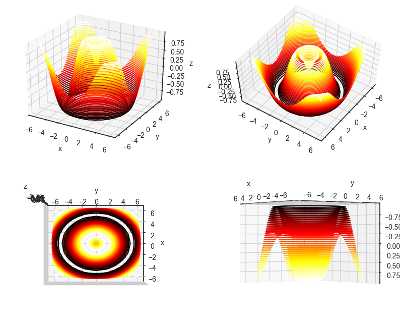
3D等高线不同视图
3.7.3. 线框图和曲面图
3.7.3.1. 线框图
线框图使用多边形组合成曲面,使用 ax.plot_wireframe 绘制:
0 1 2 3 | fig = plt.figure()
ax = plt.axes(projection='3d')
ax.plot_wireframe(X, Y, Z, color='black')
ax.set_title('wireframe')
|
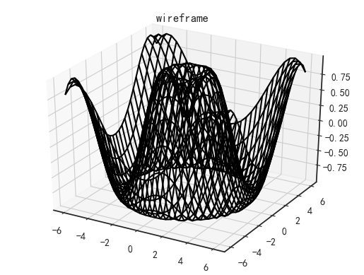
三维线框图
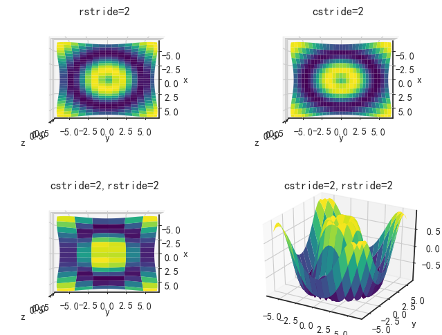
可以通过 rstride (row stride)和 cstride (column stride)参数调整 y 轴 和 x 轴上的线的密集程度,默认值均为 1,只接受整数:
0 1 2 3 4 5 6 7 8 9 10 11 12 13 14 15 16 17 18 19 20 21 22 | def wireframe_draw(ax, X, Y, Z, rstride=1, cstride=1):
ax.plot_wireframe(X, Y, Z,color='black',
rstride=rstride,
cstride=cstride)
ax.set_xlabel('x')
ax.set_ylabel('y')
ax.set_zlabel('z')
fig = plt.figure(figsize=(8,6))
ax = fig.add_subplot(2, 2, 1, projection='3d', title="rstride=5")
wireframe_draw(ax, X, Y, Z, rstride=5)
ax.view_init(90, 0) # 顶视图,查看行的线密度
ax = fig.add_subplot(2, 2, 2, projection='3d', title="cstride=5")
wireframe_draw(ax, X, Y, Z, cstride=5)
ax.view_init(90, 0) # 顶视图,查看列的线密度
ax = fig.add_subplot(2, 2, 3, projection='3d', title="cstride=5,rstride=5")
wireframe_draw(ax, X, Y, Z, rstride=5, cstride=5)
ax.view_init(90, 0)
ax = fig.add_subplot(2, 2, 4, projection='3d', title="cstride=5,rstride=5")
wireframe_draw(ax, X, Y, Z, rstride=5, cstride=5)
|

不同线密度的三维线框图
对线框图中的多边形使用配色方案进行颜色填充就成为了曲面图。
3.7.3.2. 曲面图
使用 ax.plot_surface 绘制曲面图。
0 1 2 3 | fig = plt.figure()
ax = plt.axes(projection='3d')
ax.plot_surface(X, Y, Z, rstride=1, cstride=1, cmap='viridis', edgecolor='none')
ax.set_title('surface')
|
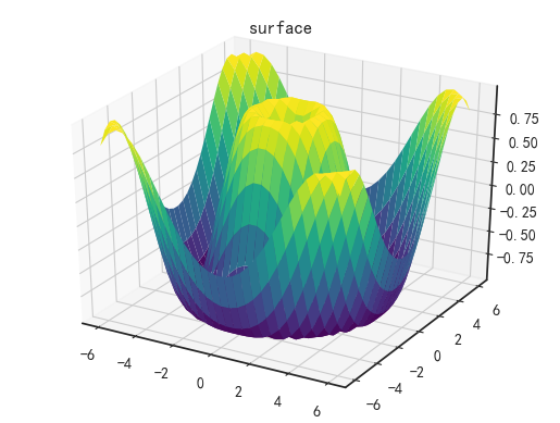
三维曲面图
plot_surface 同样支持调整 rstride 和 cstride。同时支持设置阴影。
0 1 2 3 4 5 | def surface_draw(ax, X, Y, Z, rstride=1, cstride=1):
ax.plot_surface(X, Y, Z, cmap='viridis', edgecolor='none',
rstride=rstride, cstride=cstride)
ax.set_xlabel('x')
ax.set_ylabel('y')
ax.set_zlabel('z')
|
不同线密度的三维曲面图
3.7.3.3. 极坐标曲面图
使用极坐标曲面图,可以产生切片的可视化效果:
0 1 2 3 4 5 6 7 8 | r = np.linspace(0, 6, 20)
theta = np.linspace(-0.9 * np.pi, 0.8 * np.pi, 40)
r, theta = np.meshgrid(r, theta)
X = r * np.sin(theta)
Y = r * np.cos(theta)
Z = f(X, Y)
ax = plt.axes(projection='3d')
ax.plot_surface(X, Y, Z, rstride=1, cstride=1,
cmap='viridis', edgecolor='none')
|
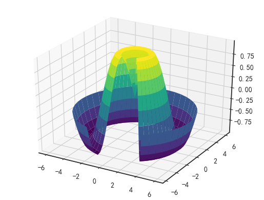
极坐标曲面图
3.7.3.4. 曲面三角剖分
有时均匀采样的网格数据显得太过严格且不太容易实现,这时可以使用三角剖分图形(triangulation-based plot)。
0 1 2 3 4 5 6 7 8 | def f(x, y):
return np.sin(x) * np.cos(y) * 2
theta = 2 * np.pi * np.random.random(1000)
r = 6 * np.random.random(1000)
x = np.ravel(r * np.sin(theta))
y = np.ravel(r * np.cos(theta))
z = f(x, y)
|
首先生成二维的随机点,然后得到三维数据,接着使用散点图观察大致形状,然后使用 plot_trisurf 绘图,plot_trisurf 使用三角形来构造表面并填充配色。
0 1 2 3 4 5 | fig = plt.figure(figsize=(10,4))
ax = fig.add_subplot(1, 2, 1, projection='3d', title='scatter')
ax.scatter(x, y, z, c=z, cmap='viridis', linewidth=0.5)
ax = fig.add_subplot(1, 2, 2, projection='3d', title='trisurf')
ax.plot_trisurf(x, y, z, cmap='viridis', edgecolor='none');
|
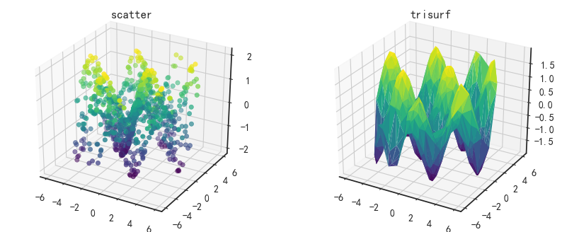
散点图和三角剖分曲面图
3.8. 子图
已经接触过 subplot 函数来创建子图:在较大的图形(Figure)中同时放置一组较小的坐标轴。这些子图可可以是画中画(inset)、网格图(grid of plots),或者是其他更复 杂的布局形式。
3.8.1. axes 子图
axes 子图又称为画中画子图,可以直接在当前 Figure 上生成新的坐标轴,可任意指定位置和大小。
3.8.1.1. plt.axes
Figure 默认会生成一个坐标轴 axes,我们可以使用 plt.axes 手动在 Figure 中创建坐标。
plt.axes 函数默认创建一个标准的坐标轴,并填满整张图。它还有一个可选参数,由图形坐标系统的四个值构成:[bottom, left, width, height](底坐标、 左坐标、 宽 度、 高度),数值的取值范围是一个百分比的小数,左下角(原点)为 0,右上角为 1。
0 1 2 3 4 5 6 7 8 9 10 11 12 | fig = plt.figure(figsize=(6,6))
# print(plt.axes) 可以默认值[0.125, 0.125, 0.775, 0.755]
plt.axes() # 绘制默认坐标
# 在 Figure 原点绘制子坐标 1,高度和宽度分别为 20% 的 Figure 的高和宽
ax1 = plt.axes([0.0, 0.0, 0.2, 0.2])
ax1.plot([0,1], [0,1], c='r')
# 在 Figure 的 60% 处绘制子坐标 1,高度和宽度分别为 20% 的 Figure 的高和宽
ax2 = plt.axes([0.6, 0.6, 0.2, 0.2])
ax2.plot([0,1], [0,1], c='m')
plt.show()
|
本示例的目的在于指明子坐标的位置和默认坐标轴无关,它是相对于 Figure 的。

通过创建子坐标创建子图
通过 fig 对象我们可以打印所有当前图像对象上的 axes 坐标对象 :
0 1 2 3 4 5 6 | for i in fig.axes:
print(i)
>>>
Axes(0.125,0.125;0.775x0.755)
Axes(0,0;0.2x0.2)
Axes(0.6,0.6;0.2x0.2)
|
Axes(0.125,0.125;0.775x0.755) 是默认坐标,其中原点为相对于 Figure 左下角 (0, 0) 向右平移画布宽度的 12.5%,向上平移画布宽度的 12.5% 作为默认坐标的原点,0.775x0.755 表示坐标轴大小,表示相对于 Figure 宽度的 77.5% 和高度的 77.5%。
3.8.1.2. add_axes
通过 fig 的方法 fig.add_axes() 也可以添加新坐标轴。 用这个命令创建两个竖直排列的坐标轴:
0 1 2 3 4 5 6 7 8 9 10 | fig = plt.figure(figsize=(6,6))
x = np.linspace(0, 10)
# 创建子图,原点右平移10%,上平移50%(等于 ax2 的原点上平移 0.1+0.4 高度)
ax1 = fig.add_axes([0.1, 0.5, 0.8, 0.4], xticklabels=[], ylim=(-1.2, 1.2))
ax1.plot(np.sin(x))
ax2 = fig.add_axes([0.1, 0.1, 0.8, 0.4], ylim=(-1.2, 1.2))
ax2.plot(np.cos(x));
plt.show()
|
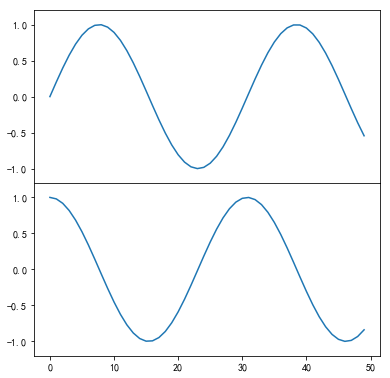
通过 add_axes 创建子图
可以看到两个紧挨着的坐标轴(上面的坐标轴没有刻度):上子图(起点 y 坐标为 0.5 位置)与下子图的 x 轴刻度是对应的(起点 y 坐标为 0.1, 高度为 0.4) 。
3.8.1.3. 子图属性
- ax.set_title 为子坐标添加标题。
- ax.set_xlim 和 ax.set_xlim 为子坐标指定范围。
- ax.set_xlabel 和 ax.set_ylabel 设置坐标轴标题。
- ax.set_xticks 和 set_yticks 设置坐标轴的标签。
- ax.set_xticklabels 和 ax.set_yticklabels 设置标签文字。
0 1 2 3 4 5 6 7 8 9 10 11 12 13 14 15 16 17 18 19 20 21 22 23 24 25 26 | fig = plt.figure(figsize=(6,6))
plt.axes() # 创建默认坐标
# 创建子坐标
ax1 = plt.axes([0.5, 0.5, 0.2, 0.2])
ax1.plot([0,1], [0,1], c='r')
# 子图标题
ax1.set_title("sub axes", fontsize=16)
# 子图坐标轴的标题
ax1.set_xlabel("x", fontsize=16)
ax1.set_ylabel("y", fontsize=16)
# 设置 x,y 轴范围
ax1.set_xlim(-1,1)
ax1.set_ylim(-1,1)
# 设定 x,y 轴的标签
ax1.set_xticks(range(-1,2,1))
ax1.set_yticks(range(-1,2,1))
# 设定 x 轴的标签文字
ax1.set_xticklabels(list("abc"))
plt.show()
|
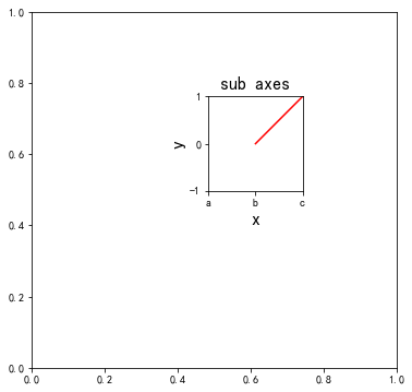
设置子图属性
可以通过 ax.set 设置多个坐标属性,例如:
0 | ax.set(title='title', xlabel='x' ylabel='y')
|
3.8.2. 网格子图
3.8.2.1. plt.subplot
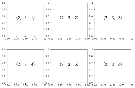
最底层的方法是用 plt.subplot() 在一个网格中创建一个子图。这个命令有三个整型参数——将要创建的网格 子图行数、列数和索引值,索引值从 1 开始, 从左上角到右下角依次增大。
0 1 2 3 4 5 6 7 8 9 | fig = plt.figure(figsize=(9,6))
# 把 fig 划分成 2*3 的网格,并一次画图
for i in range(1, 7):
plt.subplot(2, 3, i)
# 文本放置在子图的中心位置
plt.text(0.5, 0.5, str((2, 3, i)), fontsize=18, ha='center')
plt.show()
|
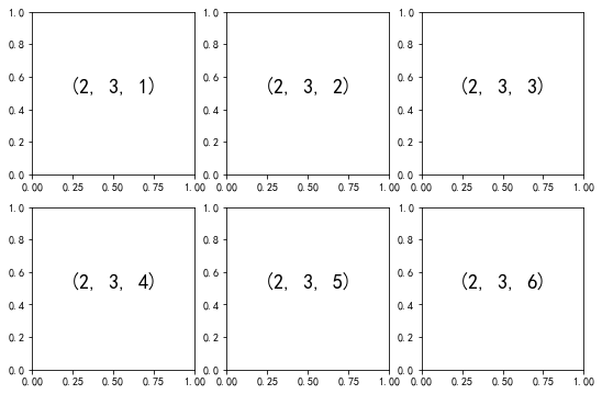
subplot 绘制网格子图
plt.subplot 方法对应面向对象方法为 fig.add_subplot,参数一致。
3.8.2.2. 子图间隔调整
plt.subplots_adjust 可以调整子图之间的间隔。
0 1 2 3 4 5 6 7 8 | fig = plt.figure(figsize=(9,6))
# 分别设置垂直间隔和水平间隔,数值以子图的高或宽为基准,按百分比生成间隔数据
fig.subplots_adjust(hspace=0.4, wspace=0.2)
for i in range(1, 7):
fig.add_subplot(2, 3, i) # 面向对象方式创建子图
plt.text(0.5, 0.5, str((2, 3, i)), fontsize=18, ha='center')
plt.show()
|
子图间隔调整
示例中垂直间隔为子图高度的 40%,水平间隔为子图高度的 20%。
3.8.2.3. plt.subplots
plt.subplots 与 plt.subplot 不同,它不是用来创建单个子图的,而是用一行代码创建多个子图,并返回一个包含子图的 NumPy 数组。 关键参数是行数与列数,以及可选参数 sharex 与 sharey, 通过它们可以设置不同子图之间的关联关系。
所谓关联关系,即它们可以使用相同的坐标等属性。
0 1 2 3 4 5 6 7 | fig, ax = plt.subplots(2, 3, sharex='col', sharey='row', figsize=(9,6))
print(type(fig).__name__, type(ax).__name__, sep='\n')
print(type(ax[0,0]).__name__)
>>>
Figure
ndarray # ax 是 NumPy 数组,存储了2*3 个的子坐标对象,索引为 [row, col]
AxesSubplot # ax 的每一个成员都是坐标对象
|
通过 NumPy 坐标轴数组来设置文本信息:
0 1 2 3 4 5 6 7 8 9 | for i in range(2):
for j in range(3):
ax[i, j].text(0.5, 0.5, str((i, j)), fontsize=18, ha='center')
# 通过索引引用子坐标对象绘图
ax[0,0].plot([0, 1], [0, 1])
ax[1,2].plot([0, 1], [1, 0])
ax[1,2].set_title("1,2", fontsize=16)
plt.show()
|
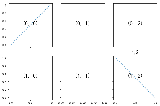
子图共享坐标轴
注意,plt.subplot() 子图索引从 1 开始,plt.subplots() 返回的 ax 数组索引从 0 开始。
3.8.2.4. 不规则网格子图
以上 plt.subplot 和 plt.subplots 示例均自动为子图分配宽和高空间,如果要绘制不规则子图网格,plt.GridSpec() 是最好的工具。
0 1 2 3 4 5 6 7 8 9 10 11 12 13 14 | fig = plt.figure(figsize=(8,6))
# 创建 2 行 3 列网格对象
grid = plt.GridSpec(2, 3, wspace=0.4, hspace=0.3)
# 通过类似 Python 切片的语法设置子图的位置和扩展尺寸
plt.subplot(grid[0, 0]) # 第一个子图占用 1 行 1 列空间
plt.subplot(grid[0, 1:])# 第二个子图占用 1 行 2 列空间
plt.subplot(grid[1, :2])# 第三个子图占用 1 行 2 列空间
plt.subplot(grid[1, 2]) # 第四个子图占用 1 行 1 列空间
# 在最后一个子图中绘制直线
plt.plot([0,1], [0,1])
plt.show()
|
参数2,3 就是创建每行五个,每列五个的网格,最后就是一个 2*3 的画布,相比于其他函数,使用网格布局的话可以更加灵活的控制占用多少空间。
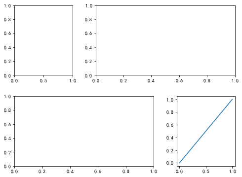
不规则网格子图
这种灵活的网格排列方式用途十分广泛,可以实现多轴频次直方图(Multi-axes Histogram),seaborn 中封装了相关的 API。
多频次直方图的示例:
0 1 2 3 4 5 6 7 8 9 10 11 12 13 14 15 16 17 18 19 20 | # 创建一些正态分布数据
mean = [0, 0]
cov = [[1, 1], [1, 2]]
x, y = np.random.multivariate_normal(mean, cov, 2000).T
# 设置坐标轴和网格
fig = plt.figure(figsize=(8, 8))
grid = plt.GridSpec(4, 4, hspace=0.2, wspace=0.2)
main_ax = fig.add_subplot(grid[:-1, :-1])
x_hist = fig.add_subplot(grid[-1, :-1], yticklabels=[], sharex=main_ax)
y_hist = fig.add_subplot(grid[:-1, -1], xticklabels=[], sharey=main_ax)
# 主坐标轴画散点图
main_ax.plot(x, y, 'ok', markersize=3, alpha=0.3)
# 次坐标轴画频次直方图
x_hist.hist(x, 40, histtype='stepfilled', orientation='vertical', color='gray')
x_hist.invert_yaxis()
y_hist.hist(y, 40, histtype='stepfilled', orientation='horizontal', color='gray')
plt.show()
|
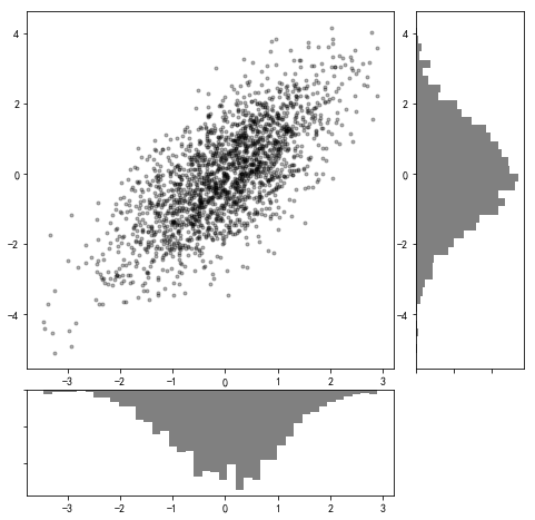
多轴频次直方图